- Apps & Services
- Datasets
- Research Tools
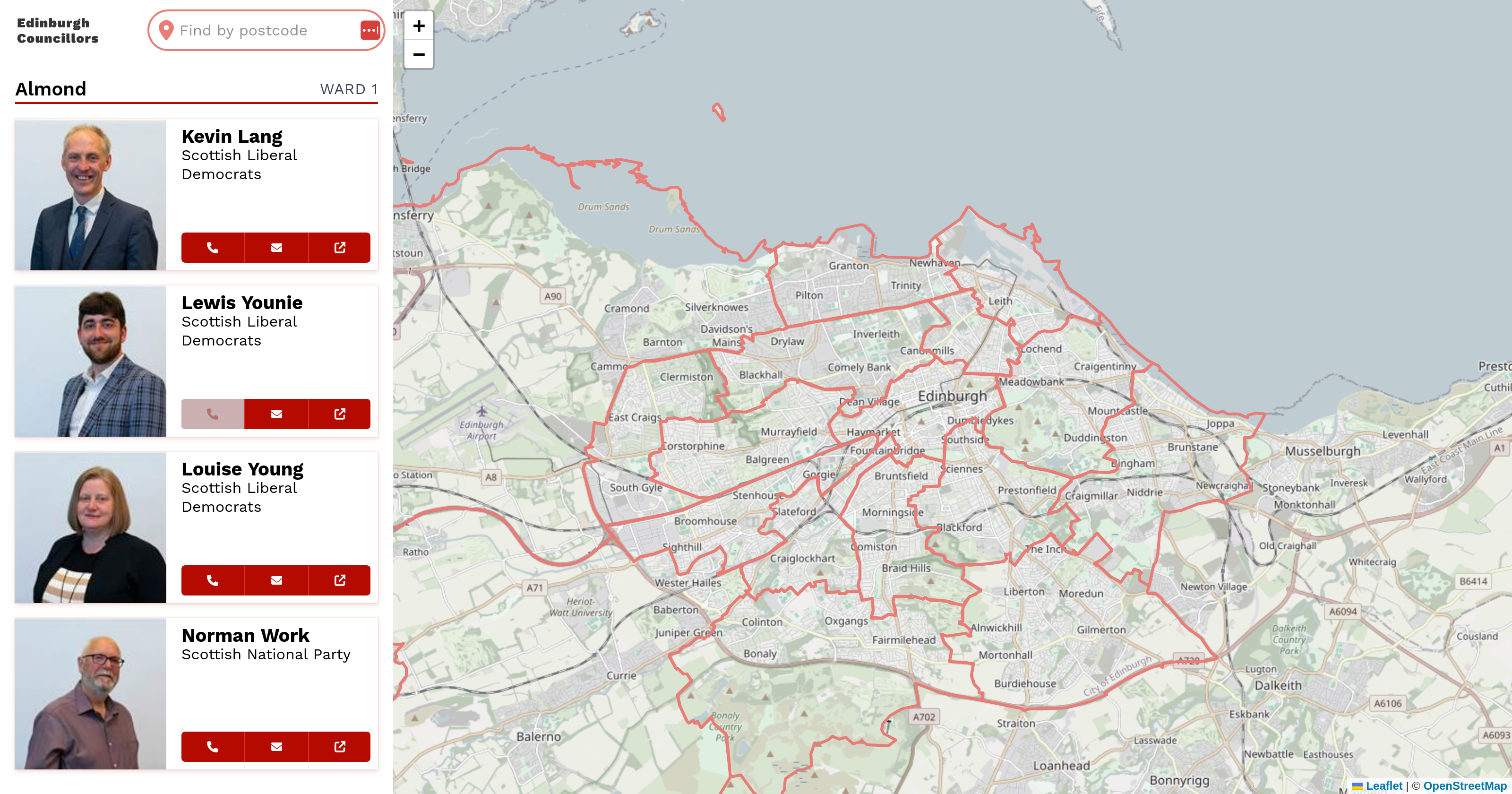
Find Your City Councillor
I gathered data on my city councillors and turned it into a simple app that is easy to use on any device.
How I Built It
I used Cypress and Node.js to gather and process the data, then built the app with Vue.js and Leaflet.