UI Component Library

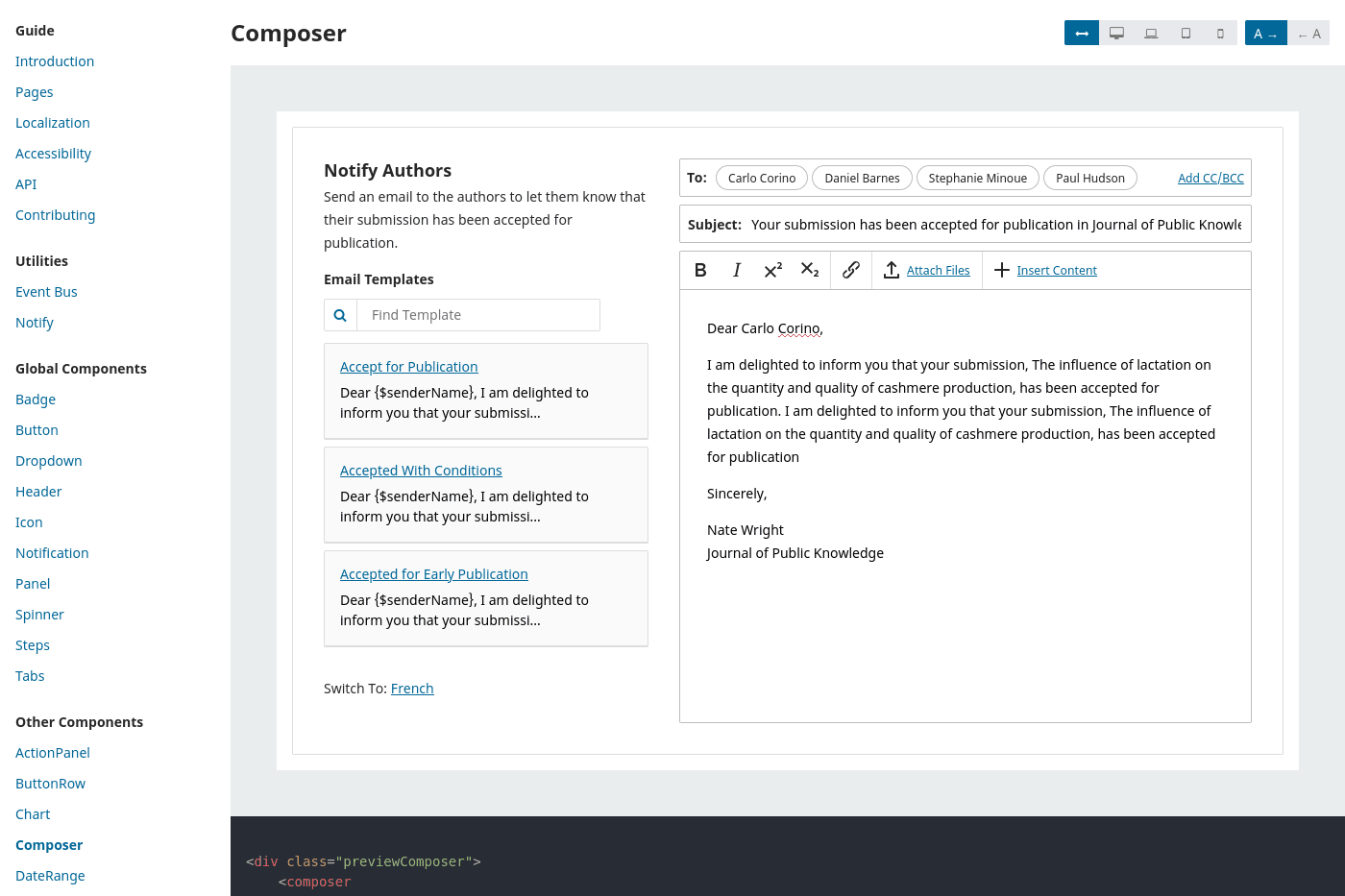
I designed and built a UI component library for the world's most widely used scholarly publishing software. Built with Vue.js, the library acts as a development tool, a documentation resource, and a collection of accessible components for everything from tabs to step-by-step workflows.
I wrote almost every component, mixin and utility in the Public Knowledge Project's UI Library. This library powers the editorial backend of PKP's open-source applications, where editors triage submissions, manage peer review assignments, and publish scholarly articles, books and preprints. Their flagship software, Open Journal Systems, is used by more than 30,000 journals in 100+ countries and dozens of languages.
The component library includes everything from simple buttons and badges to tabs and forms. I adopted third-party components wherever possible, but there weren't many that supported our localization and accessibility requirements off-the-shelf. So I often had to write bespoke components, like keyboard-friendly handles to reorder items. Sometimes, I was able to use a third-party library by writing a small wrapper in order to implement accessible controls, like I did with the modals and dialogs.
ListPanels
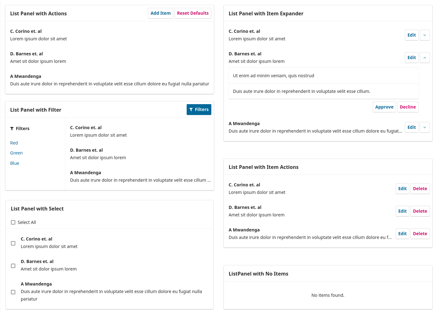
One of the first components that I built for this library was the <ListPanel> (docs, source). There are dozens of different data models in the system and each one of them needs a slightly different UI to view and edit them. So I built the <ListPanel> to be an extensible component that would work with a lot of variations.

I used slots so that my colleagues could easily adapt the lists to serve their needs, while enforcing some constraints that helped them use the component in a consistent way across the app. In it's simplest form, a <ListPanel> only needs to be passed an array of items.
<ListPanel> <list-panel
:items="[
{
id: 1,
title: 'Example One'
}
]"
title="Example"
/>
A developer can add actions to each item by using the predefined item-actions slot.
<ListPanel> with an edit button for each item. Example <list-panel
:items="[
{
id: 1,
title: 'Example One'
}
]"
title="Example"
>
<template v-slot:item-actions="{item}">
<button @click="edit(item.id)">
Edit
</button>
</template>
</list-panel>There are several pre-defined slots that allow developers to change the header, add a sidebar, or override the list item completely to implement more complex features like an expandable, accordion-like list item.
<list-panel
  :items="items"
  title="Example"
>
  <template v-slot:item-actions="{item}">
    <expander
      :isExpanded="expanded.includes(item.id)"
      :itemName="item.title"
      @toggle="toggleExpanded(item.id)"
    />
  </template>
  <template v-slot:item-expanded="{item}">
    <!-- Add expanded details here -->
  </template>
</list-panel>
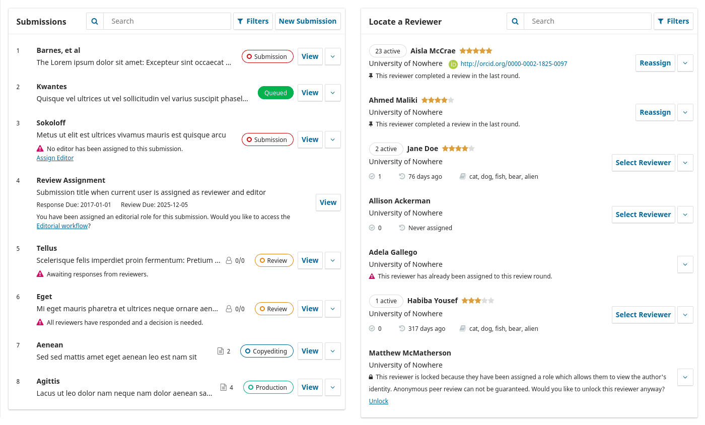
Using the <ListPanel> as a base, I was able to build several composite components to find a peer reviewer, track submissions, and upload files.

Autosave and Dropped Connections
When I worked on a ground-up rebuild of our submission wizard, I implemented an autosave feature to make sure that authors would never lose their progress (docs, source). Once we started saving data on their behalf, we had to figure out how to handle dropped connections gracefully. If an author loses connection when going through a tunnel or working on dodgy wifi, I wanted to make sure the system wouldn't fail them.
I solved this problem by creating a queue (source). When a dirty form is detected, the autosave data is sent to the queue and the HTTP requests are processed one by one. As soon as the queue detects a lost connection, the request payload is saved to the browser's local storage and the app begins pinging the server to detect the connection status. Once the connection is restored, it will pull the autosaves out of local storage and process them. Autosaves can be replayed like this even if the user has closed the browser and returned later.
In our software, third-party plugins can add new fields, forms and custom components to the submission wizard. To support these use cases, I decoupled the autosave feature from the default forms and abstracted it into a mixin (docs) that allows plugins to send a payload to the autosave queue: just a data object, a timestamp, and the URL to send it to. These autosaves can be sent to any API endpoint and the UI treats them the same as autosaves triggered by the core application.
Accessible Date Range Picker
When we added a UI to view visitor statistics, we needed a way for users to select a date range. I looked into third-party date picker components, but everything in the Vue ecosystem at the time had accessibility problems. We didn't have the time to build a fully-working date picker ourselves, so I opted to implement a lightweight alternative.
The result is a simple, keyboard-accessible dropdown that lets users select from a predefined list of date ranges, like the last 90 days or the last 12 months. It also provides a basic text input for users to type in the date range. We found the presets were more intuitive for users and using the text inputs turned out to be faster than a date picker for selecting lengthy reporting periods, like a calendar year.
The library started with a few components and developed gradually as part of a long-term project to refactor an old jQuery UI. By the time I left, it had outgrown itself. The library would benefit from introducing some better abstractions to help manage a large-scale UI: state management, TypeScript, utility CSS classes, and an API abstraction for mocking server interactions in testing and development environments. The library itself could be abandoned in favor of Storybook. When we began, Storybook didn't work well with Vue's dev tools, so I built the library app as an alternative development and documentation tool.
But code is never done — especially in an open-source project. As part of a small team, I only worked on the UI Library part time. Much of my time with the Public Knowledge Project went into full-stack work developing new features, modernizing the PHP backend, and handling the technical documentation for the project. If that work doesn't interest you, take a look at a small data-driven app I wrote to find my local city councillors.